Business goals
Generate leads and promote La Trobe Open Day events.
Project Challenges
- only 3 weeks to deliver product
- limited data available from previous app
- poor map experience
Team
Team Lead/Scrum Master, Senior Product Designer, UX Designer, Business Analyst, Senior Developer, Frontend Developer, Cadet Developer
Role
Senior Product Designer
Responsibilities
Product architecture, wireflows and wireframes, interaction and UI design, user testing, prototypes, accessibility, performance optimisation, test scripts.
The problem
Open days are a major events for the University where they do their best to attract new students. Activities are held across multiple campuses with staff volunteers on hand to help students find their way and answer general questions. Specialists are available at many of the activities where students will be able to gain a better understanding of what it's like to study at La Trobe.
With so many activities available, we had to find a way to help students plan their visit and only 3 weeks in which to do it.
Design Process

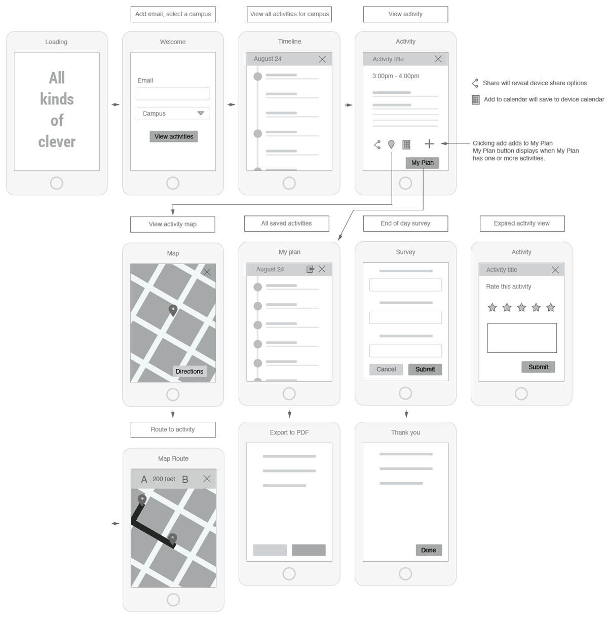
Wireflow diagram showing basic screens and pathways

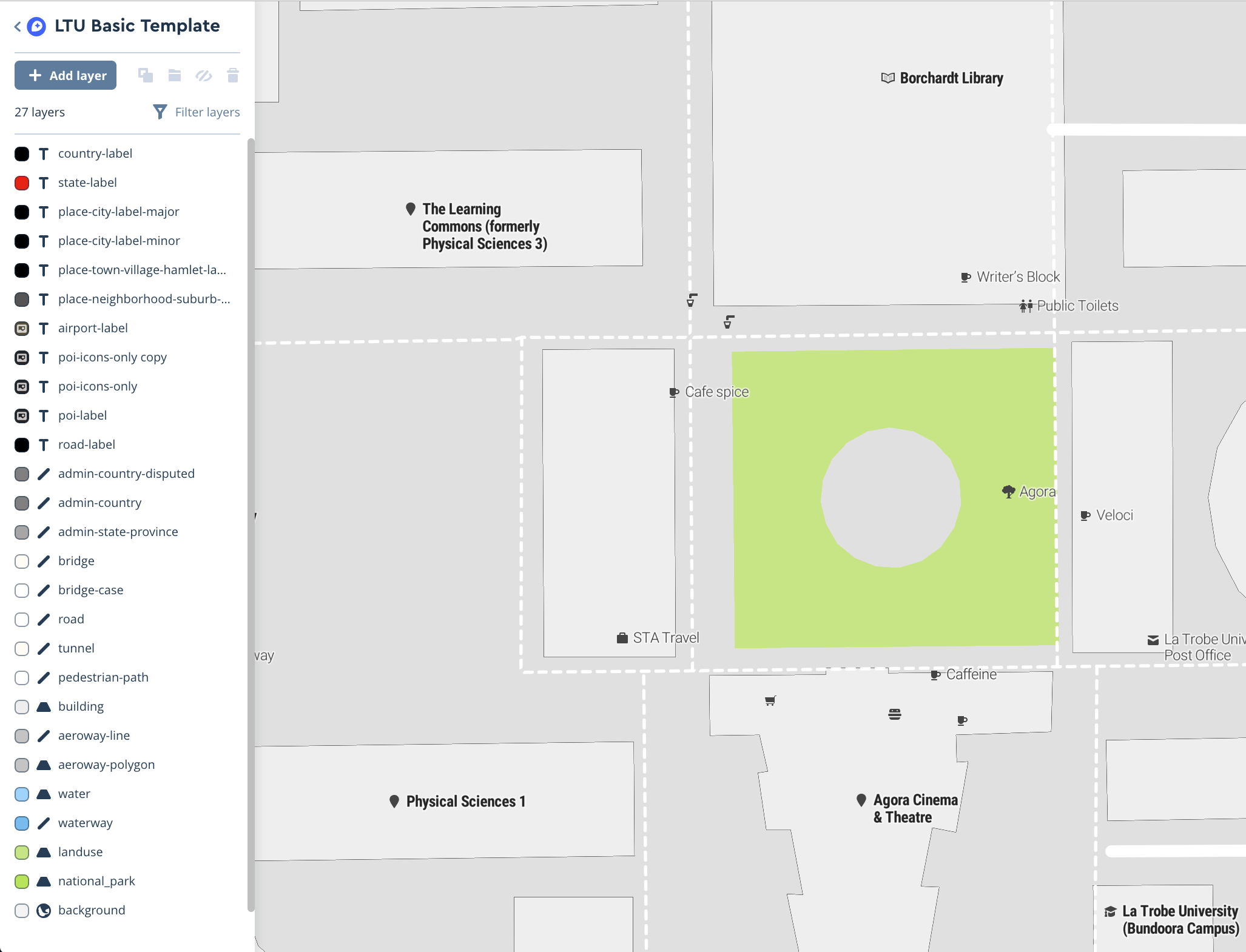
Defining our map overlay styles
We started with a discovery exercise to learn about previous open day events. Our Marketing department provided us with stats, programs, staff experiences and business goals.
From the program, I identified that many of the rooms used for the activities would not have reliable mobile connections, in which case the planner might not work on the day. A problem I'd have to keep in mind.
Break the rules
With no time to interview users or perform extensive research, I'd have to rely on well known UI conventions. I created a wireflow to audit all necessary screens and basic interactions. This was shared with stakeholders to ensure it covered all their requirements. The interface would need:
- A way to identify you and store your plan
- A way to select your campus
- A clearly identified date and location
- A list of all activities for that date and location
- Clear presentation of the time and location of each activity
- A way to learn more about an activity
- A map showing the location
- Directions to the location
- A way to add this activity to your plan
- A way to view your plan
- A way to share and print your plan
- A way to provide feedback after an activity had finished
Capture users
Lead generation was really important to the business so we required users to create an account using an email address. Users would retrieve their saved plans, share with friends or family and export to PDF using their account.
Wireframes and user testing
I created low-fi wireframes and built an interactive prototype in InVision which I user tested on high school students. Testing revealed problems with low contrast on some elements. Users were not always able to identify a clear pathway to the map routing screen.
Gather Feedback
Users indicated that they would not likely complete the requested survey after each session but stakeholders were not open to reducing the number of surveys. To minimise user workload and reduce interruptions, I convinced the stakeholders to allow only one alert. Each survey was reduced to 2 fields and I modified the interface so all surveys would live on a single screen where they would be submitted via Ajax to give immediate user feedback for each submission.
Better maps and wayfinding
From previous experience we knew that Google Maps could not provide the routing experience we needed on campus. There are too many paths and access points Google is just not aware of. We decided to populate Open Street Maps with the missing data. Then I customised a Mapbox baselayer to La Trobe styles and tested how building labels were handled at various zoom levels to get the ensure building codes were switched to full names at the correct moment. All routing destinations are geo-coded to building entrances to help users find their way.
Performance and accessibility
We proceeded to build a single page application using Navigo routing engine. As the build progressed I tracked quality via Lighthouse audits and performed accessibility testing, ensuring screen reader compatibility, seamless keyboard navigation and focus management and minimal cognitive load.
Offline experience
We'd never built a Progessive Web App before, but this would be a perfect way to address our mobile connectivity issues and ensure a seamless user experience. Together with the Senior Developer, I defined routines for storing updates to the users plan and sending updates once connectivity was restored. This also had tremendous performance improvements as there was no delay in the UI as all data updates would be done in the background.
PDF download
Students often discuss their future studies with parents and advisors. Printing their plan was a great way to help them do this but also a challenge for our team. Luckily our cadet had been testing a PDF generator for us. I created a design for the PDF output and the developers did a great job getting it all set up in a couple of days.
Final testing
A second round of user testing was performed leading to some minor improvements around sign-posting to ensure clarity across all 5 campuses and dates.
Outcome

Lighthouse audit results

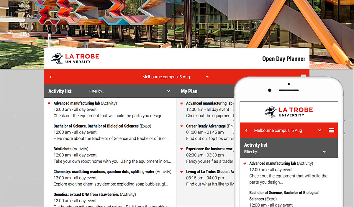
3 weeks from zero to launch. Open Day Planner single page application.